CONCEPT + DESIGN
AMOCA Rebranding
Background: After completing the first of seven courses in the Professional Program of Graphic Design at UC Berkeley Extension, I gained knowledge and experience in creating graphic forms with purpose to achieve desired outcomes. I enjoyed every step of the journey, especially learning about the evolution of graphic design as a practice and as an industry. The goal of this final project was to apply the principles we learned in the course to create a new visual identity for a museum that peaks our interest.
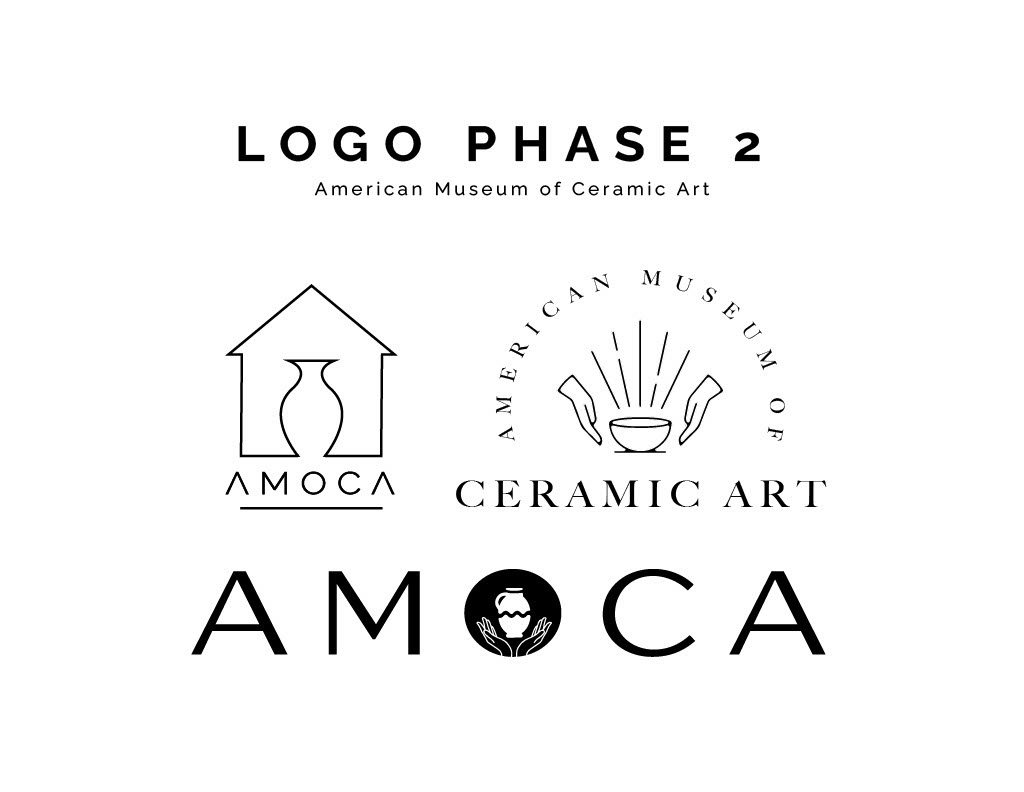
Design Process: I decided to tell people the story and identity of the American Museum of Ceramic Art located in Southern California. AMOCA has a rich ceramic and arts tradition and draws in a local and regional audience ranging from all ages to unravel the creative thinking behind the making of ceramic objects. They strive to serve a diverse audience with the goal to increase the aesthetic appreciation of clay as an art form.
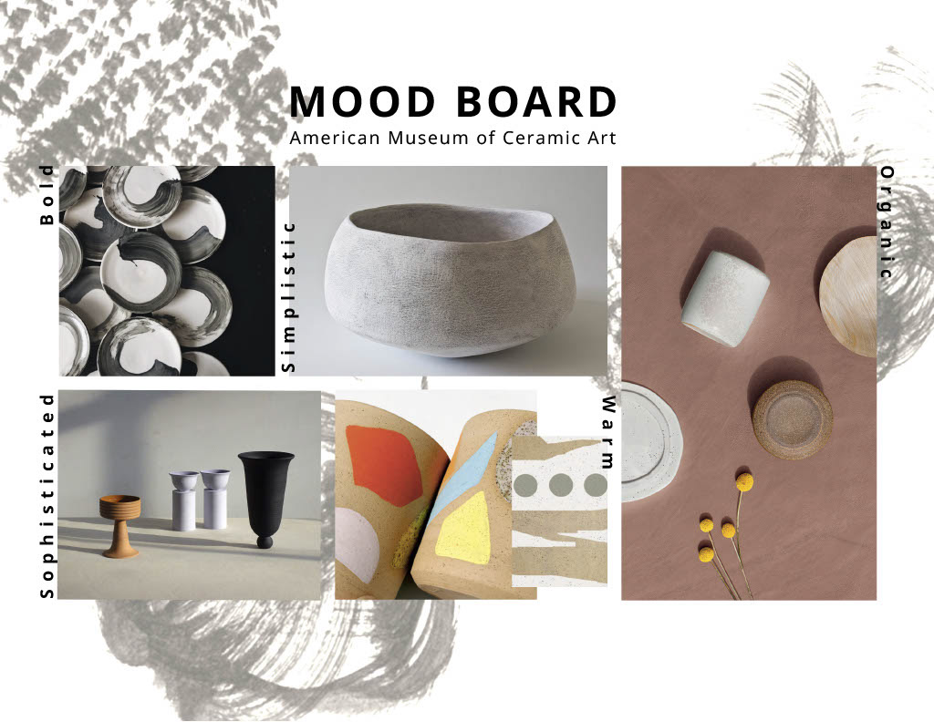
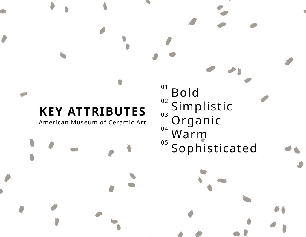
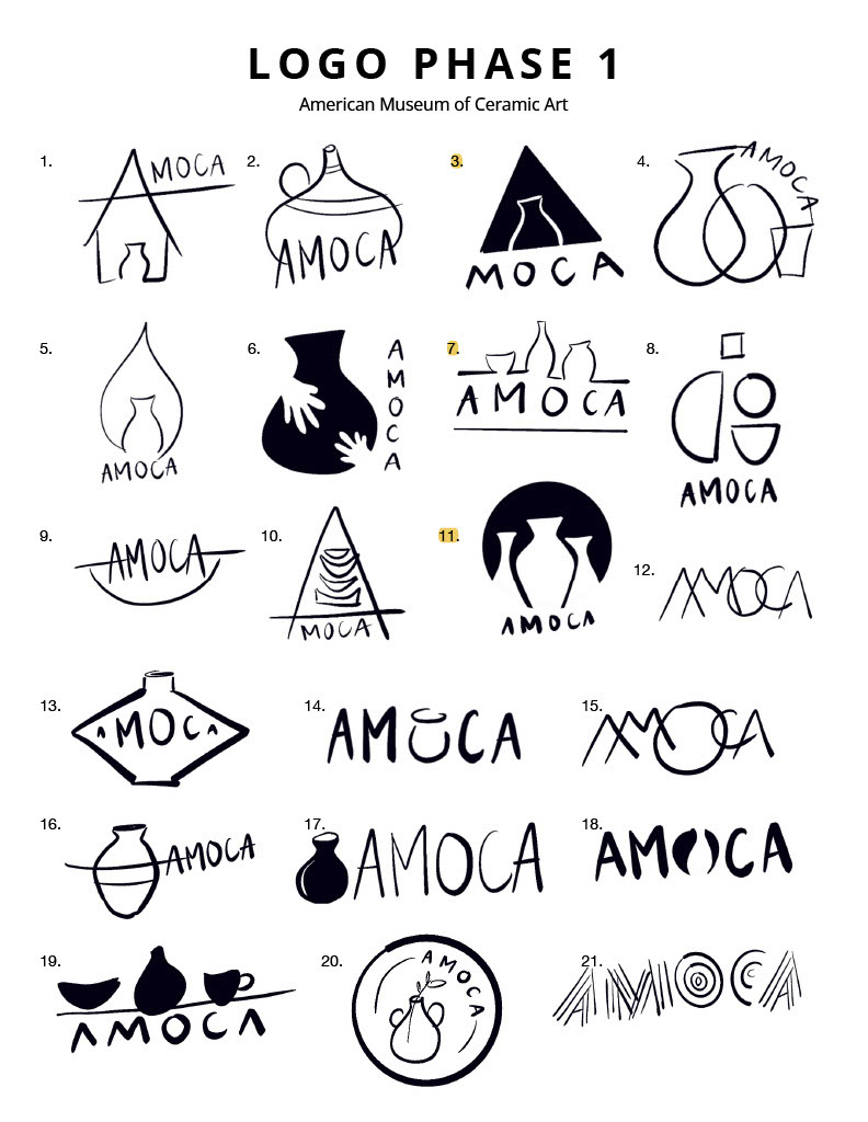
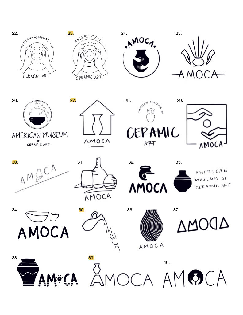
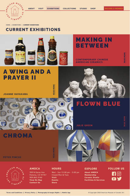
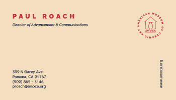
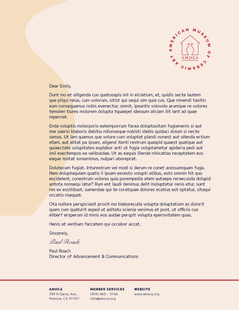
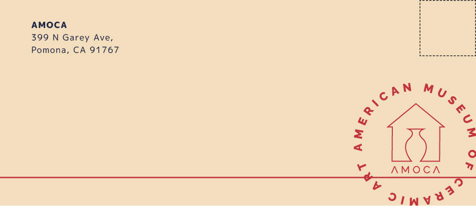
The rebranding process looked like this: Step 1: Mood board & key attributes (five descriptors); Step 2: Design a logo (40 sketches); Step 3: Brand identity (typography palette and color scheme); Step 4: Stationery creation (brochure, business card, letterhead, and envelope); Step 5: Mockup three website pages
Design Solution: I experimented with geometric typefaces and patterns for rebranding the museum. Being that most visitors are elderly travelers and young school students on a field trip, the museum’s modern exhibitions attract people of all ages which further demonstrates their mission to promote cross-cultural understanding and provide new perspectives and insights which enrich our lives. With this in mind, I wanted to create a more friendly and playful rebrand so anyone could come by after work or over the weekend casually and delighted. My design tells a story about diversity and inclusion.
Class: Visual Design Principles, Summer 2020
Software: Photoshop, InDesign, Illustrator
DESIGN PROCESS:
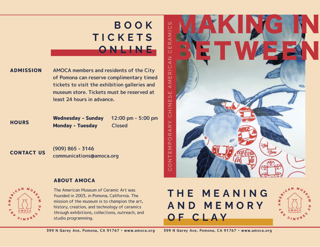
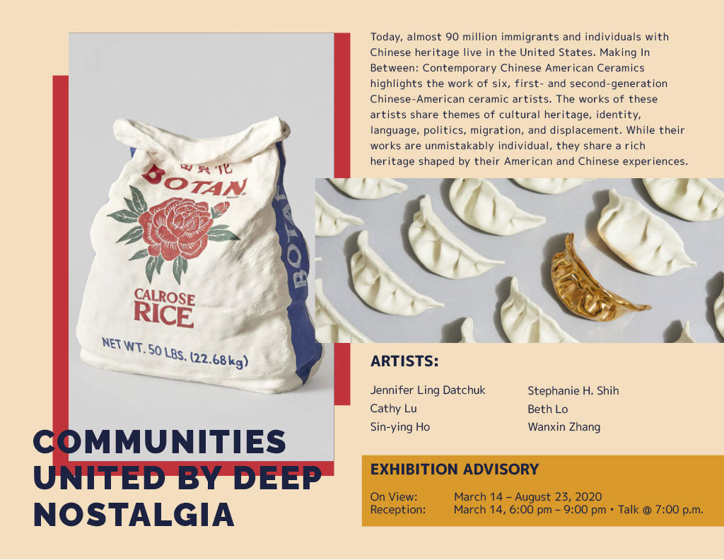
BROCHURE:
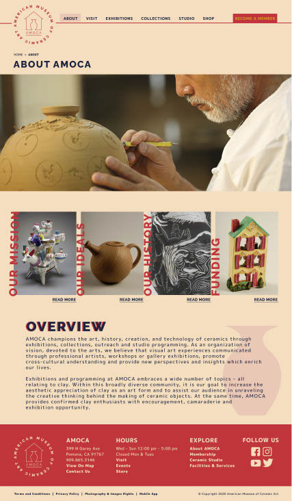
WEB DESIGN:

STATIONERY:


BRAND IDENTITY:

