CONCEPT + DESIGN
Hasbro Billboards

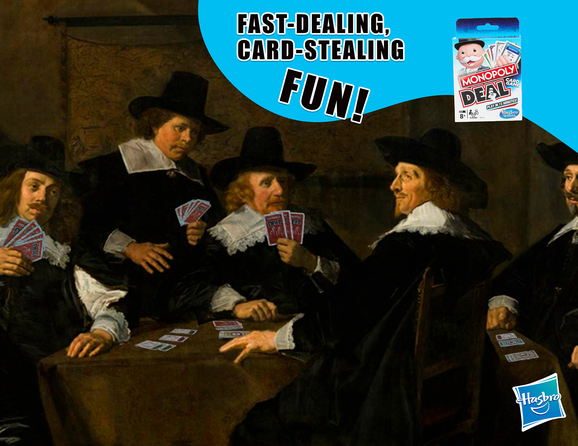
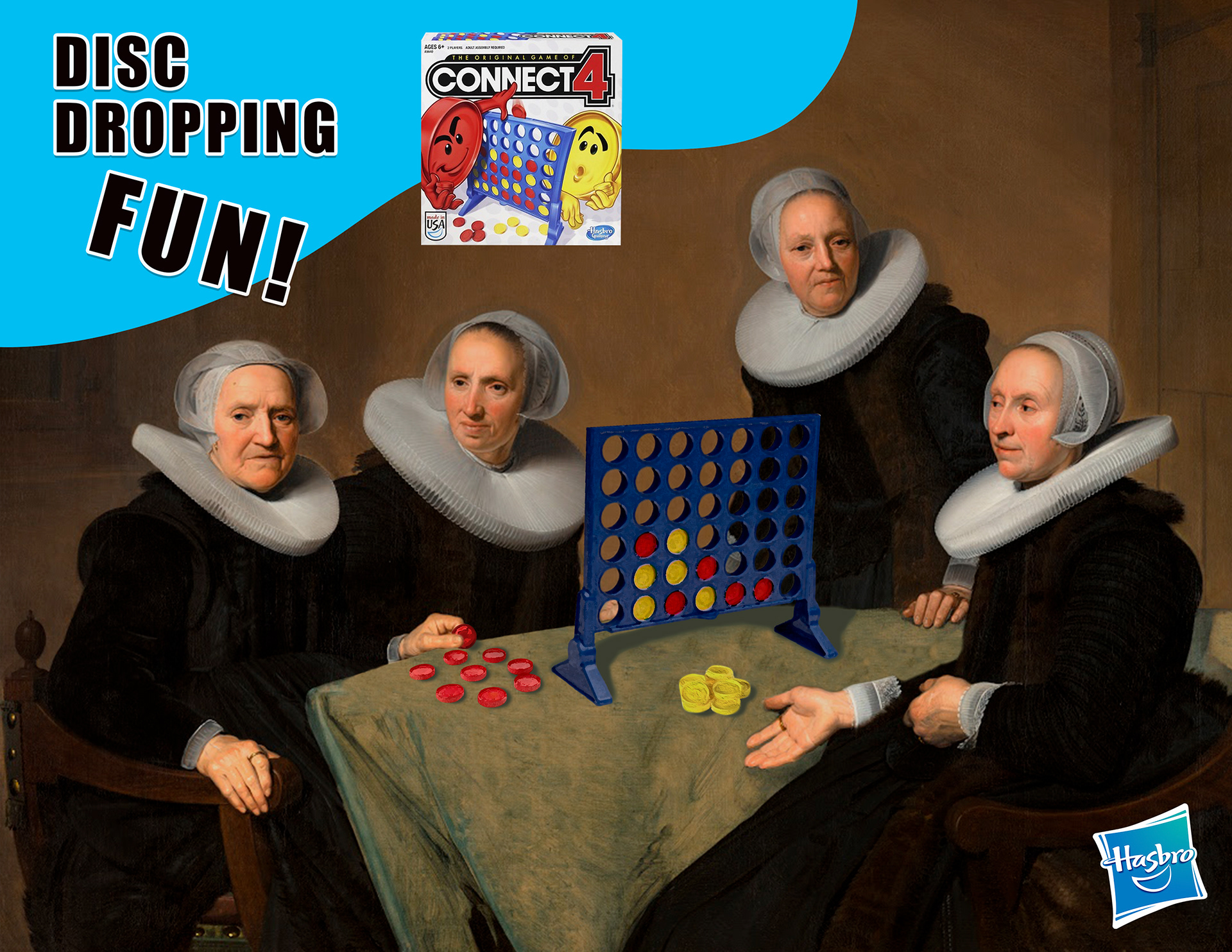
Background: For this project, I was tasked to create a series of three different, but cohesive print advertisements combining an existing piece of artwork and a product of choice. The objective was to make the product appear as if it is a part of the original painting, in color, texture, and lighting. I chose to feature paintings from the Baroque period in advertisements for Hasbro Games.
Design Process: What's more dramatic than a painting by Caravaggio? A game of Monopoly Deal. That's when I decided to marry the two together. I knew I wanted to create something humorous, electric, and eye-catching so my approach was determined by Baroque painters who have a knack for making their figures' facial expressions over-the-top and downright exasperated, just like a Hasbro Game.
Design Solution: Once I landed on the pieces I wanted to feature, I decided to reference nostalgic 90's kids commercials to help inform the layout. I wanted the ads to feel captivating, wistful, and like something you'd stumble upon when watching commercials as a kid. To make the billboards unmistakenly outspoken and cheeky, I went for high saturated hues with bold and stylized display fonts. The burst of blue illustrations helps to create the fun, playful vibes of the brand.
Class: Photoshop I, Fall 2020
Software: Photoshop