Interstate Payroll
Interstate Payroll is a client with a mission to serve small/local businesses in Upland, California. They’re dedicated to providing firsthand payroll services with professionalism, responsiveness, and quality.
Since their business is quickly expanding, the owners reached out to me to design a scalable logo for signage and stationery. I was also tasked to create a brand identity that is distinctive and communicates reliability. Because it was my first time diving into the world of freelance, I am immensely grateful that my client entrusted me with this entire process.
Role: Logo Design, Brand Identity
Timeline: June - July 2021
Timeline: June - July 2021

DESIGN PROCESS
As I learned more about the brand, it stood out to me that the founders of Interstate Payroll were proud of the intimate relationships they have fostered with their clients. As a small business themselves, they understand what it means to build a company from the ground up and therefore customized their technology and service experiences to match. Knowing this, my goal was to design the brand to highlight its approachable appeal with a minimalist, cool, and clean feeling.
Sketches
Digital comp of client's favorites #1
Digital comp of client's favorites #2
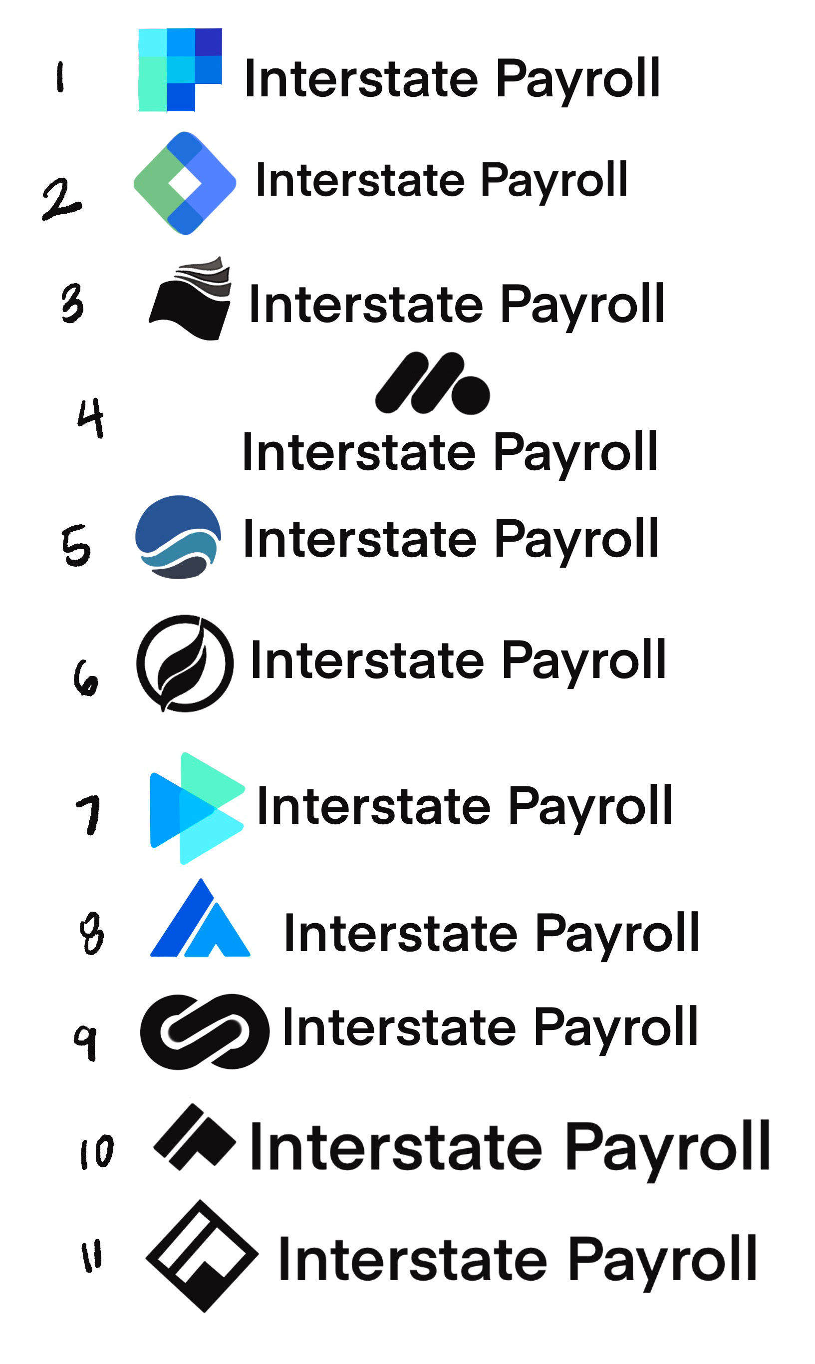
STAGE 1
I proposed 11 logo concepts, experimenting with "IP" monograms and geometric marks. The design needed to strike a delicate balance: appeal to locals and convey credibility to small businesses.
STAGE 2
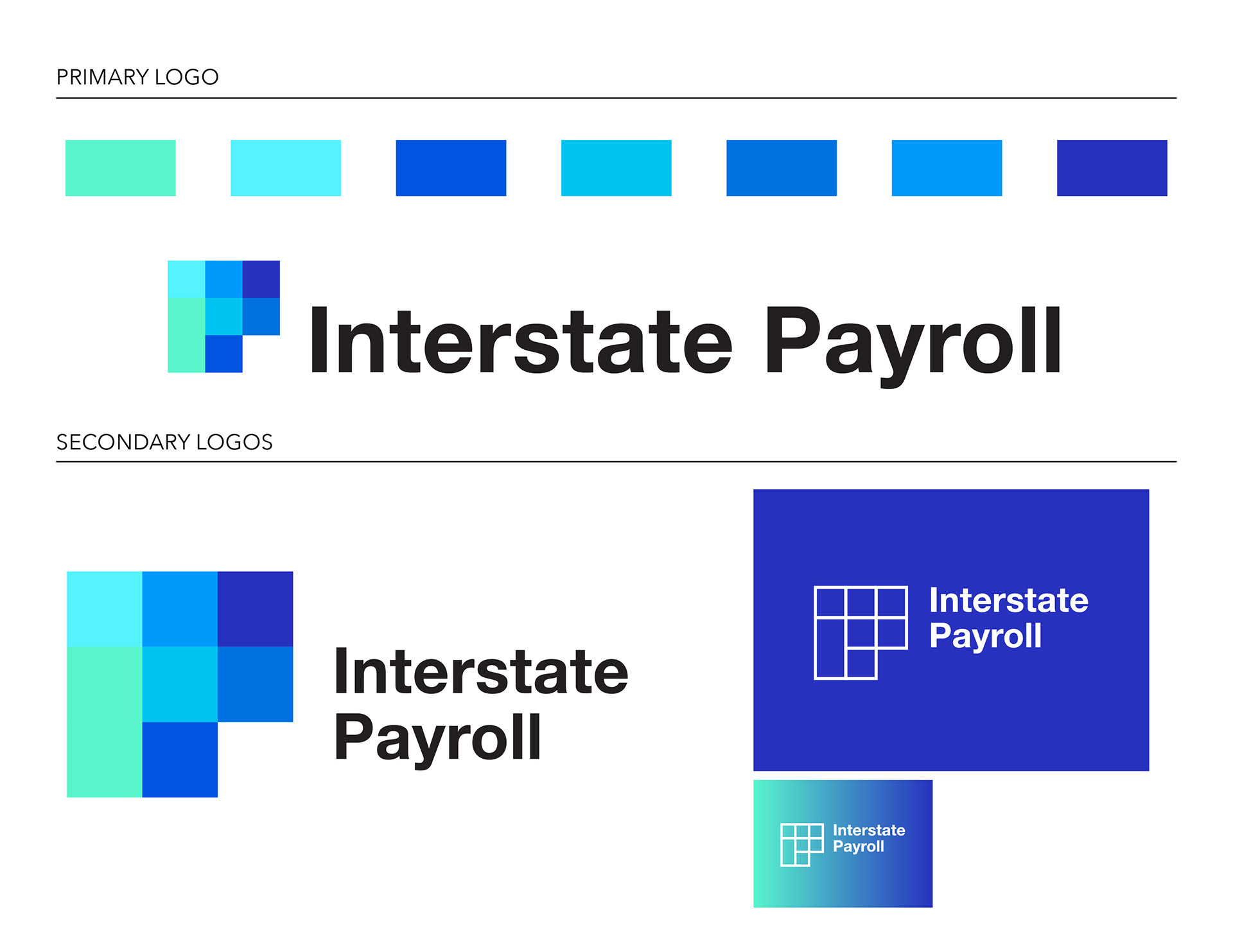
After selecting the top 2 concepts through a company-wide vote, I moved onto Stage 2, refining the sketch drafts into rough digital versions. To stay on-brand, all concepts followed the play on "IP" with simple, geometric shapes, which is used to communicate a sense of trustworthiness and stability.
STAGE 3
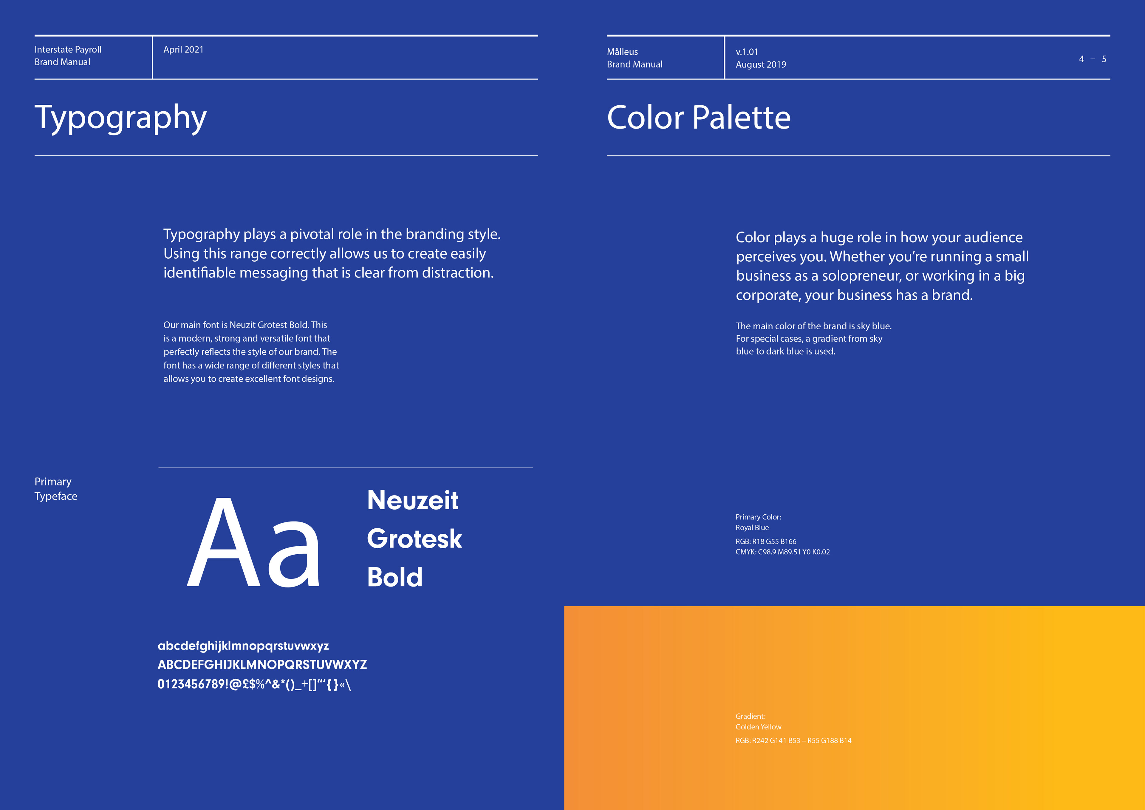
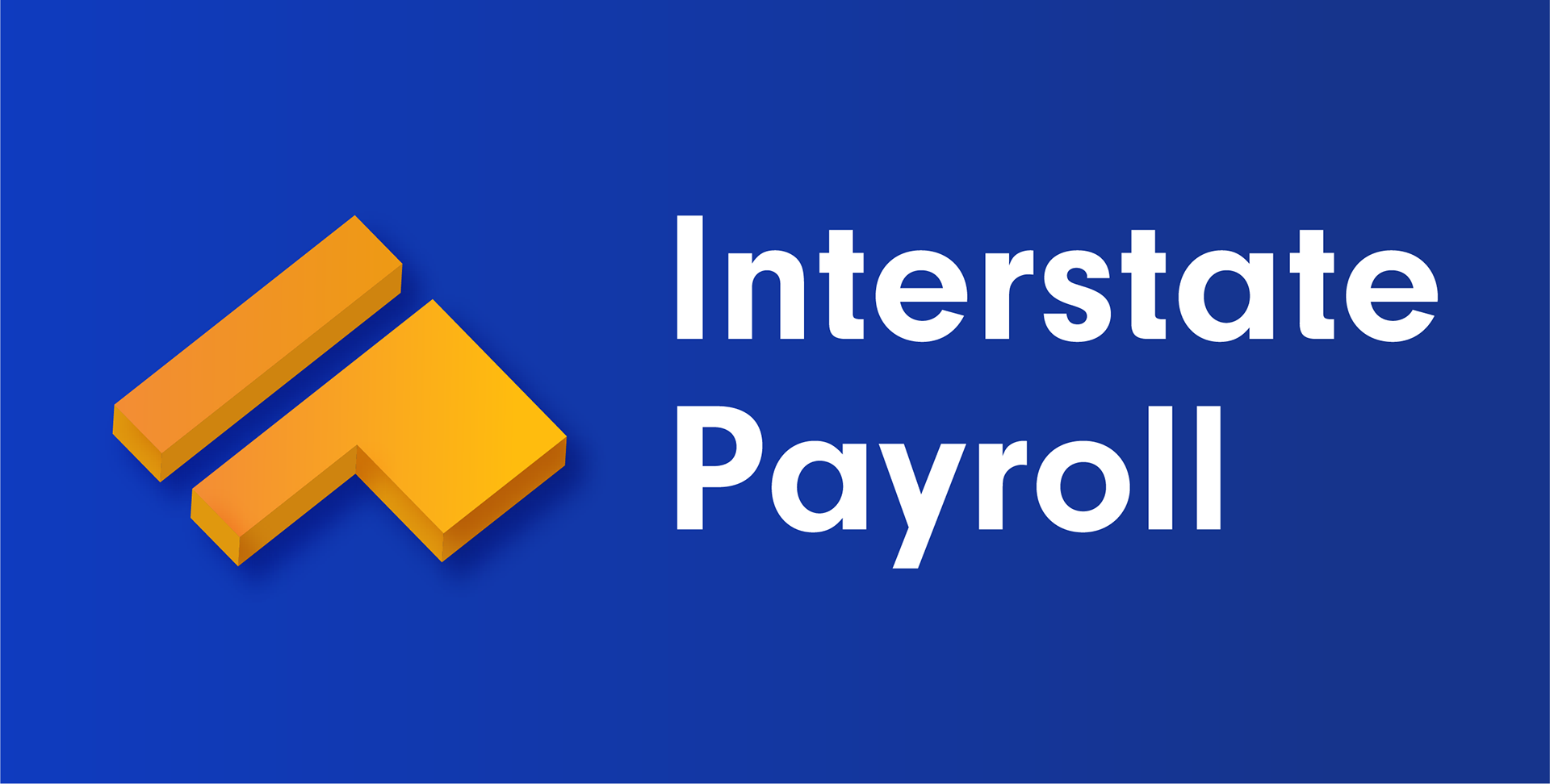
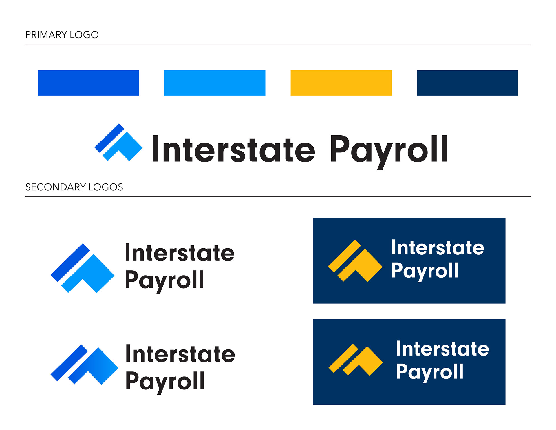
We went with concept #2, which I developed into a finalized logo design. To increase visual impact and add depth, we agreed upon making the pictorial mark 3D. A deep navy blue provokes feelings of trust, security, and reliability while the golden gradient creates the impression of movement forward towards a bright future.
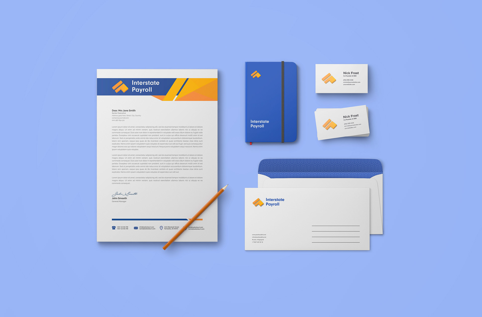
LETTERHEAD:
BRAND GUIDELINES: