CONCEPT + DESIGN
Knives Out Campaign

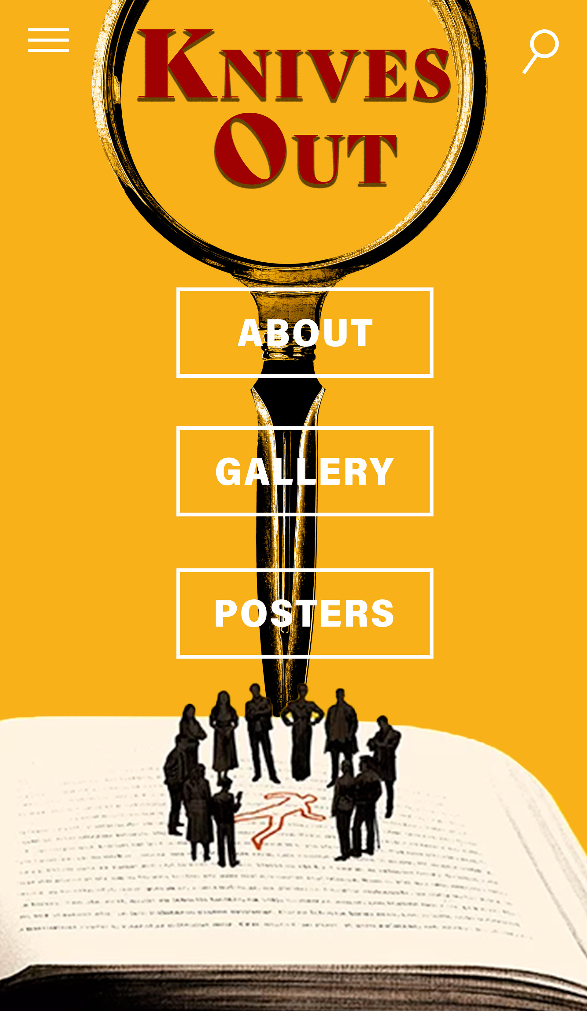
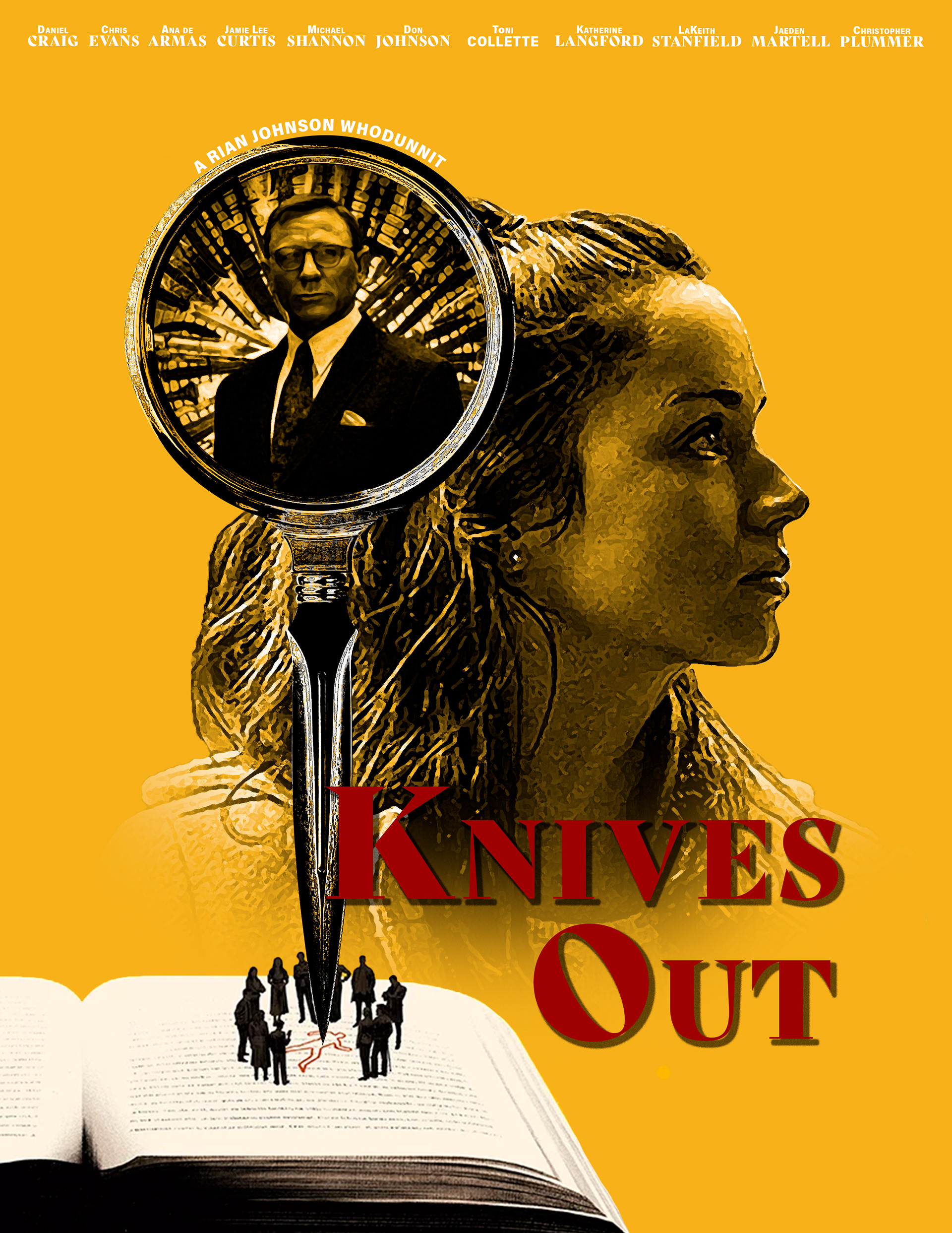
Background: The objective of this assignment was to design a movie poster, site, and app that showcases layering and blending techniques using Photoshop. Having recently rewatched a personal favorite, Knives Out, I gravitated towards its wit in the way it tackles humor, social commentary, and a twist on the traditional “whodunit” genre.
Design Process: The first step in my process for this project was to watch the movie to determine any themes or elements that could translate visually. One that jumped out to me right away was the spoof of the retro murder mystery aesthetic. The other was the play on light in the mansion, setting up a world that was unsettling yet just warm enough that it was still somewhere the audience wants to be.
Design Solution: To play off of the concept of retro murder mystery, I decided that the stills I pulled for the campaign would be in black and white and structured around the dagger magnifying glass. I provided a tonal framework with the color palette and typography accents. I used red to anchor the color palette for the title as a nod to the more unsettling elements of the film while the surrounding bright yellow was used to convey light and warmth.
Class: Photoshop I, Fall 2020
Software: Photoshop