CONCEPT + DESIGN
Type Classification Posters
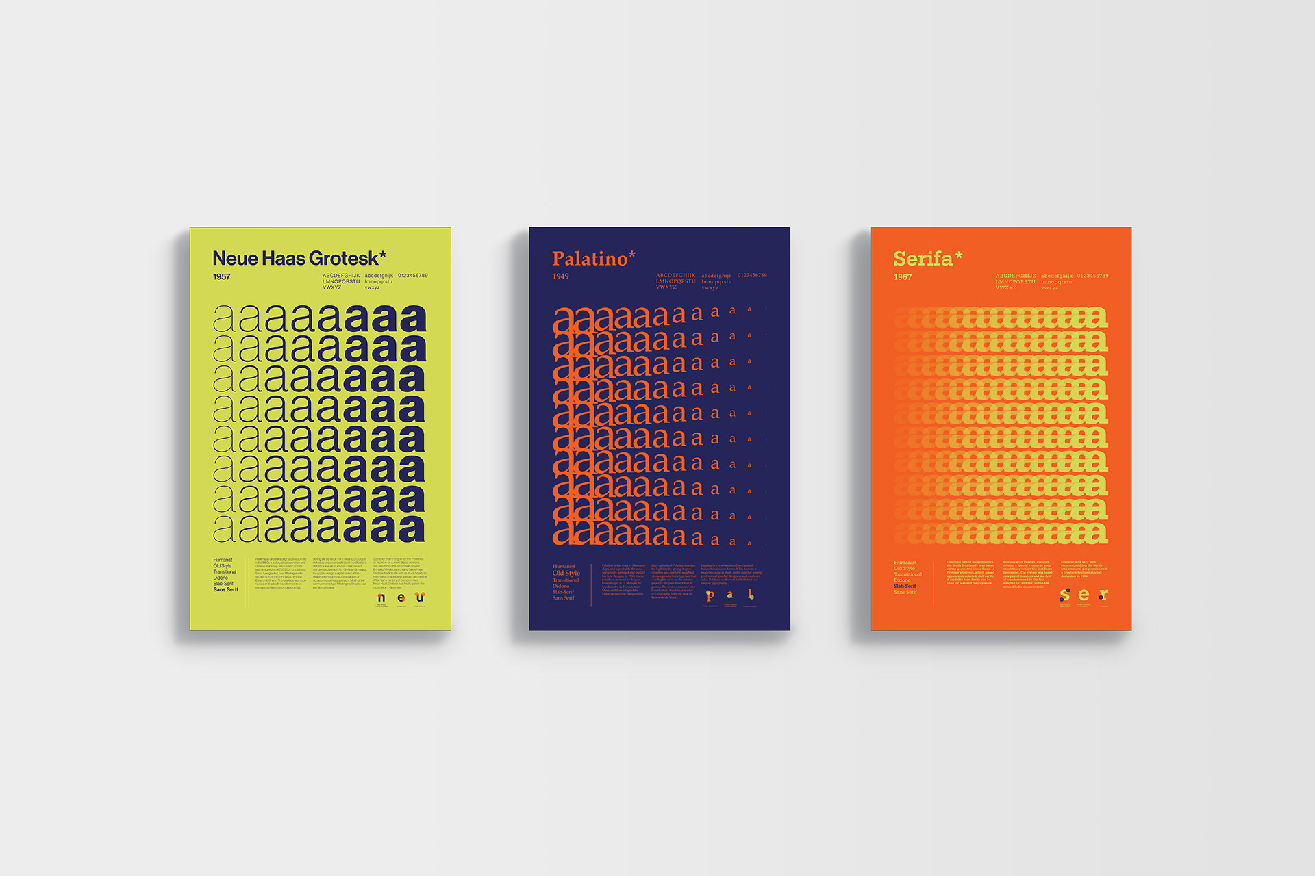
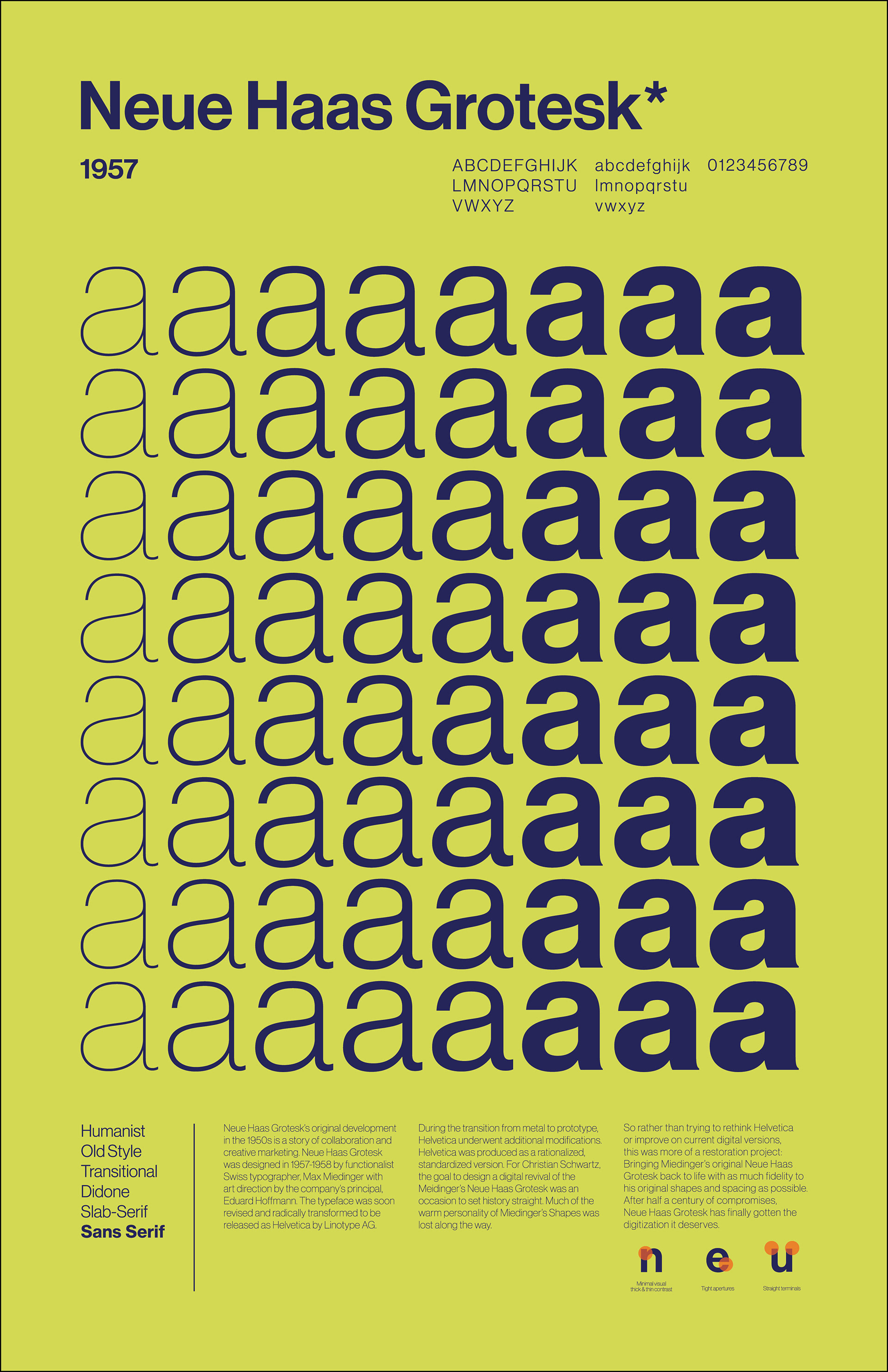
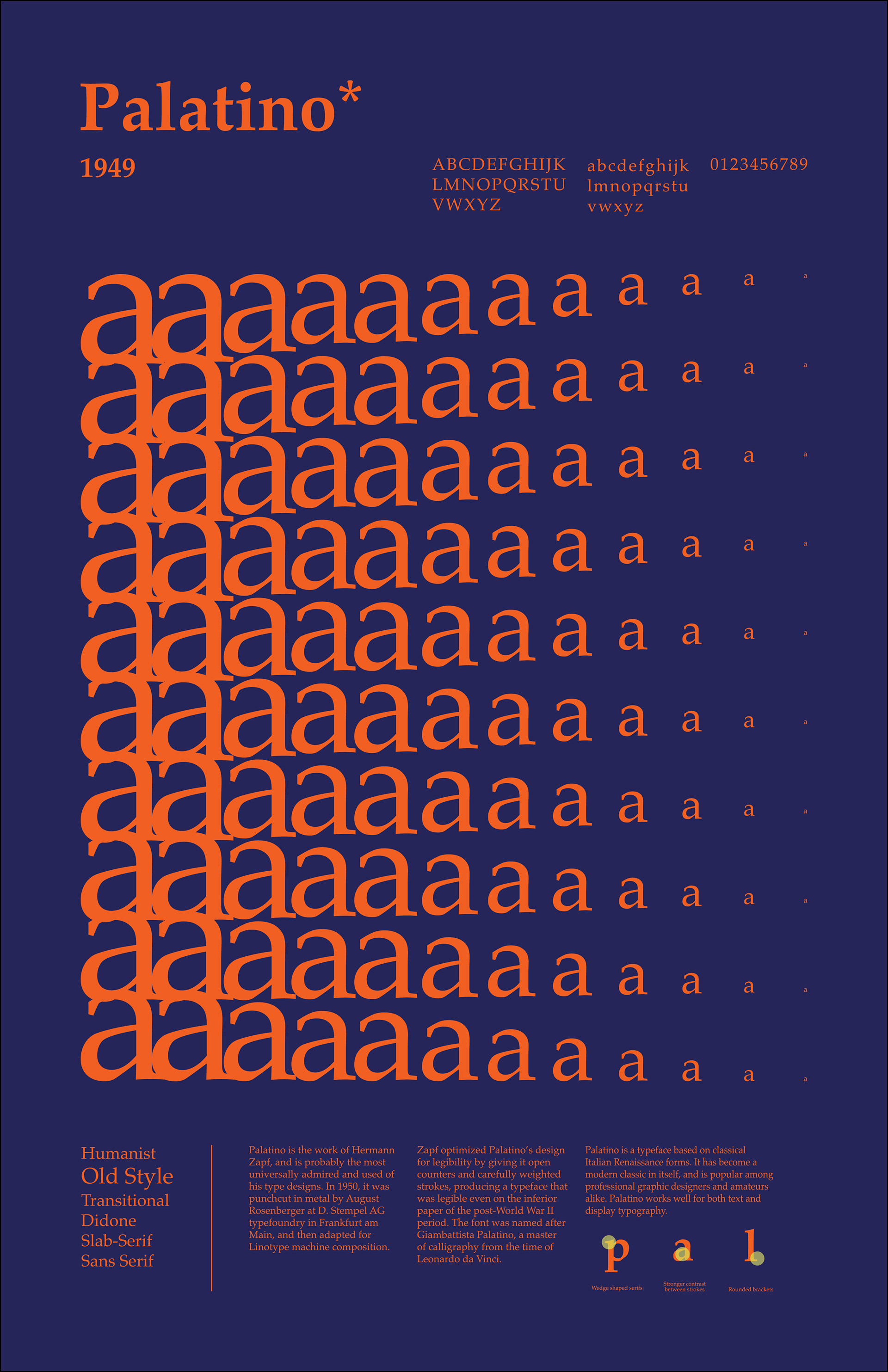
Background: The goal for this project was to visually communicate the evolution of type and practice the principles of typography. I designed three informational posters about type classifications including their history, designers, and characteristics. While each poster presents only one type category, all three needed to work together as a set.
Design Process: I began the design process by researching the Vox System and Swiss designers. With the information I gathered from books, periodicals and the internet, I was most inspired by the simplicity, legibility, and objectivity of designers like Josef Müller-Brockmann and Hans Neuburg, who sought a universal graphic expression through grid-based design. Combined with the principles of Swiss design, I knew I wanted to find a fun and aesthetically pleasing way to showcase all a typeface has to offer.
Design Solution: I created posters that would accent each of fonts’ characteristics and style by repeating the letterform “a” in each typeface to create an abstract design layout. My goal was to portray scale, movement, and energy with gradients from using the different properties of type — weight, size, and color. Each poster consists of the name of the typeface, the year it was designed, who created it, and the letters and numbers of the typeface. The most challenging part of this project was laying out the hierarchy of the written text in order of importance.
Class: Fundamentals of Typography, Spring 2021
Software: InDesign